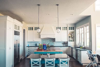
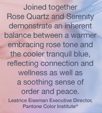
 When I was working in interior design years ago one of my favorite subjects was color. How it affected the room was dependent on what direction the natural light came into the room. How it affected the people living in that space was also a great consideration. People who seemed more sedate were attracted to environments that provoked a sense of energy. People who were a bit high strung tended towards a more quiet color scheme so preferred the taupes, blues and greens. Color is one of the easiest and cheapest solutions to creating a mood for your living space. Which color you select for a room will create a sense of balance and relaxation or discord and intensity.
One of the current trends starting to make traction in the design community is developing interiors that cater to families with aging parents, especially those struggling with dementia. As research has shown that certain colors bring a sense of calm while others agitate people it makes sense to capitalize upon that knowledge. Designing living space for seniors who used to love to get energized by their environment can be challenging. What used to evoke excitement would cause stress or possibly frighten those with memory loss. In this article by Lauren Hunter of Handley Wood she sites the contrasts of slick surfaces and mirrors as elements that can cause the most stress. The traditional rules of color design to connect space is challenged when working with people who suffer memory loss. Use of different colors in various rooms goes against traditional design in a home but can be done subtly so as not to create that clown pant look.
Of course when selling a home it’s best to create what I call that Teflon look. In other words nothing sticks to the buyers memory other than how clean and open the house looks. But if you’re thinking of selling and have family members who struggle with memory then think about pre-painting the new space to help them identify their new space. If you can carry the current color palette over to the new place it will help with the transition even if only on a subliminal level.